

|Articles|January 27, 2016
The potency of portability
If your veterinary practice's website isn't mobile-friendly, you may be losing clients.
Advertisement
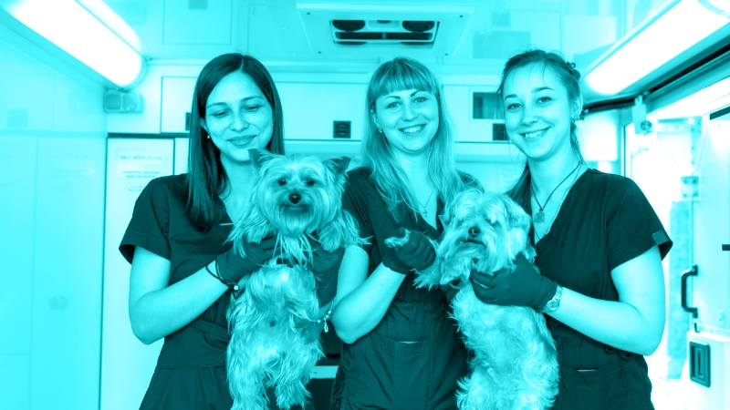
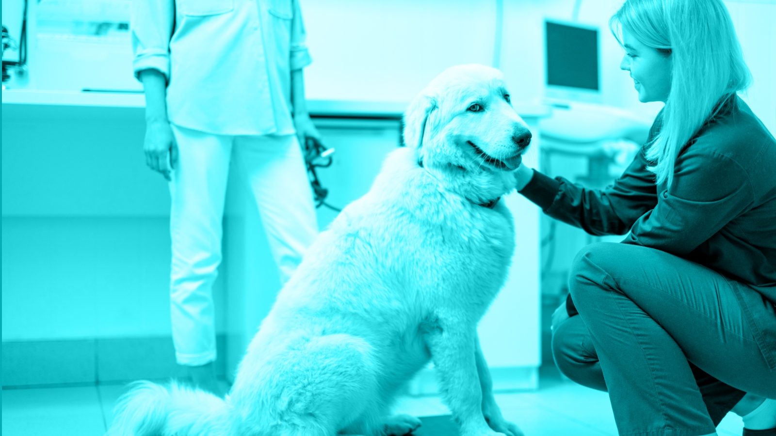
Get smart! Smartphone-friendly, that is. (Getty Images)At a session on hot trends for veterinary practices at the 2016 NAVC Conference, practice consultant Karen Gavzer, MBA, CVPM, said now not only do you need to have an informative and up-to-date website, you need to take it even further.
Advertisement
Take it further? But you've been faithfully posting pics of precious patients. (And if you haven't,
Today's consumers want access to everything on the go, including your veterinary practice. It's all about reaching people through the small screen. Not TV screens (most of which aren't really so small anymore, right?), but the ones that fit in your clients' hands-their smartphones. Your website must be mobile-friendly.
What does mobile-friendly mean? The information on your web pages should be easily viewable and interactive in a small-screen format that works well on clients' mobile phones. More easy “scroll and click” and less “Turn it this way … no, turn it that way.”
Not sure if your website is easy on eyes when it comes to mobile? You can test it on this
Still not convinced everyone's learning about you with their thumbs? Check out this stat from Google: 94 percent of Americans with smartphones search for local information on their phones and 77 percent of mobile searches occur at home or at work, places where desktop computers are likely to be present.
In other words, it's all about the smartphone. So dry those tears, and go get mobile-friendly.
Advertisement
Related Content
Advertisement


Latest CME


Advertisement
Advertisement
Trending on dvm360
1
Tornado (the dog) touches down at the emergency department
2
Every 30 extra minutes under anesthesia raises complication risk in brachycephalic patients, underscoring the importance of peri-anesthetic management
3
Q&A with an emergency veterinarian on critical care and common ER misconceptions
4
Paws and profits: VetEvolve names first chief veterinary officer, NVA appoints two board members, and more updates
5