Hanging with Hafen: Find a veterinary hospital that's just right
Many veterinary hospitals will be too big or too small. Keep trying until you find the perfect fit.
Feeling a little like Goldilocks going from veterinary hospital to hospital trying to find exactly what you want? After all, hospitals—like bowls of porridge—come in all shapes, styles, and configurations.
They can range from a gigantic 24-exam room, multi-specialty hospital (with an MRI, CT, and linear accelerator) in Los Angeles to a two-exam room facility on the North Shore of Oahu, Hawaii. (That owner probably bailed the Los Angeles basin madhouse.) With each hospital I’ve designed, I’ve tried to make it personal and special for that client and his or her specific situation.
Some hospitals have been fancy, some have been high-tech, some were straightforward and some innovative. I look back and a unique few strike me as “just right.” That’s not to say the others didn’t make the clients happy or help provide the best possible medical care. Some even won awards, but I’m talking about the hospitals that felt right to me. In the next few columns I’d like to take you on a tour of some of the hospitals that rang my bell.
Amazingly enough, a number of the hospitals that felt just right were itty-bitty. Big facilities can be fun to design and they certainly can be impressive, but I think small hospitals are actually harder to create. In a large hospital you can obscure small problems in a maze of exam rooms and hallways. After all, if a room isn’t quite right, not big enough, too big, or in the wrong location, a different one can fill the need. In a small hospital you don’t have that luxury. Every square foot counts.
The first design I want to share never got built. I got to talking with a veterinarian I had worked with years earlier about a little building somewhere in the Midwest that he was going to make into a new hospital. It was only 1,600 square feet and it contained a number of jigs and jogs. The doctor wanted to improve on the approach and push up the capacity. I said I’d give it a try. The plan (pictured below) was what I came up with given the restrictions of the space. To my surprise the veterinarian didn’t like my plan—but I still do. He built something else. I saved the plan in my files. For me, it just felt right.
Click here to keep reading
Doctors’ station
Perpendicular to the hallway, and providing a link from the hallway to the outside wall, is the doctors’ station. This hospital was too small to allow for a real doctors’ office. Instead the doctors sit in an alcove off of the hallway. Maybe you would say that this wouldn’t work for you, but the point of the plan is to have the doctors where they are accessible, instead of being hidden somewhere in the back. The doctors’ station also has the added bonus of being adjacent to an exterior wall with windows!
Greeter’s Desk
The reception desk isn’t much. It’s more like the podiums you see in restaurants where the hostess stands. We call this a Greeter’s Desk, and the point is to remove the barriers between the receptionist and the client. Maybe you have gone into your local Apple store recently. They don’t have a checkout counter. All the transactions occur on the fly with iPads and hand-held card swipes.
This used to be radical new technology, but now you can find it at your local burger joint. Why can’t veterinarians do the same? You don’t really need a desk for your receptionist to hide behind. Across from the Greeter’s Desk is a small wall of retail. Every hospital has some retail needs, and this wall is front and center to the client.
Exam rooms
The exam rooms are small. In the past the standard was one exam room per 1,000 square feet of gross facility area. In this four-exam room plan, we have one exam room per 400 square feet. Not bad. After all, 80 percent of a typical hospital’s income is derived directly from the exam rooms. The more exam rooms you have, the more money you make.
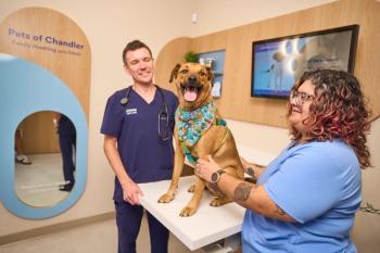
The layout is modeled on the exam rooms in my pediatrician’s office. On one wall there is seating for the clients. On the perpendicular wall sits the exam table for the patient, and adjacent to it is a small counter. The doctor stands beside the client and together they can gather around the patient. The room brings people together to focus on the patient. It also frees up the floor space in the center of the exam room so the doctor can easily get down on the floor with the patient if necessary. The counter adjacent to the exam table is big enough to let the doctor set down his computer. Beneath the counter are a few drawers for miscellaneous supplies and equipment. There is no sink. You don’t need one.
One-door exam rooms
The plan has only one-door exam rooms. This is a good way to make a small hospital space efficient. All the traffic takes place in this central hallway without a duplicate hallway behind the exam rooms. Yes, there can be congestion and confusion in the hallway. However, with the exam room doors off of the hallway instead of directly off of the waiting area, a doctor can duck into an exam room without being seen.
Natural light
One of the nice things about this little building? Floor-to-ceiling windows. The windows let light into the doctors’ station. They also let light into the dog ward. We have recently been creating environments that are conducive to healing. In human hospitals, researchers have found direct correlations between patient rooms with windows and reduced patient stress and faster recovery rates. Animals, like people, need windows, too. In this plan, the cages face a full wall of windows. With glass doors from the ward and a glass wall into surgery, it’s possible to borrow light from the ward. It also allows the doctors to see into the ward and monitor the patients.
Surgery and treatment
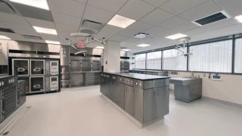
The surgery is not large because a facility this size is primarily an outpatient hospital. The X-ray room is minimal, too, and designed to be digital with no dark room.
The treatment room is the functional center of the hospital and, to be honest, I could have done it a bit better. Often we do L, T, H, E, or F-shaped islands in the center of treatment. In this case I think I could have fit an L-shaped island into the space where I located a single peninsula workstation. It would have doubled the capacity and freed up more of the surrounding cabinet space for the lab and pharmacy.
Utilities
Finally, in an alcove I located what I call the support and utility functions: a stacked washer/dryer, a mop sink, a freezer, and on the wall a small on-demand water heater instead of the normal freestanding variety. Because they’re in an alcove off of treatment, these utilities are immediately accessible, minimizing hassle.
This plan was actually designed as a cat hospital, so if you’re still struggling with how small things are, imagine it as a cat-only facility. If you are in an urban area like New York, you may be more open to the size of the rooms considering the square foot price of real estate.
The bottom line: I hope you gained some new ideas. Maybe this challenged some of your preconceptions. Maybe there are things that you would definitely change. And that makes sense. Your job, when you work with your architect or builder, is to find the “sweet spot” that makes the design of your hospital just right for you.
Newsletter
From exam room tips to practice management insights, get trusted veterinary news delivered straight to your inbox—subscribe to dvm360.


