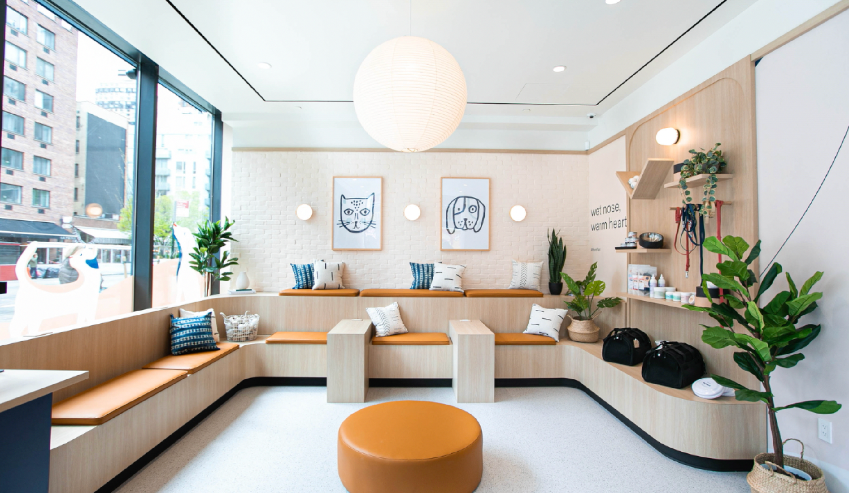
Curb appeal
While you may think all the action takes place inside your hospital, the front of your facility is hard at work speaking on your behalf. The question is, what's it saying? "Come on in"-or "Go away"?
One of the most prominent topics of discussion among the 2007 Hospital Design Competition judges was signage—the good, the bad, the invisible. In fact, we couldn't get Veterinary Economics Editorial Advisory Board member Dan Chapel, AIA, to shut up about it. So we decided we needed to go more in-depth. So as not to offend any of you gentle readers, we snapped pictures of dentists' offices in the Lenexa, Kan., neighborhood surrounding the Veterinary Economics offices. Then we sent the photos to Chapel and let him loose. Here we present his critiques of signage and curb appeal in the world of teeth—all of which can be applied to the world of veterinary care.


Signage: With Gentle Dental, a large, attractive sign is visible from both roads that form the intersection where the practice sits (although Chapel advises block lettering over script in most cases), and another sign identifies the practice from the back, where clients enter the building.


Curb appeal: The building is striking, with plenty of interesting details surrounded by grass and foliage. Low bushes draw the eye to an appealing sign (above). In the back (right), a tree, bushes, and clear walkway guide visitors to the entry.
Signage: Dr. James Belfield is doing a lot of things right, Chapel says. The lettering of his sign is big and bold—although, if possible, a contrasting color would be better than white on beige.


Curb appeal: The interesting roofline, the potted plants, and the tree all work well, Chapel says. The problem with this front view is that the blinds are pulled down—not a welcoming signal. "I don't like blinds," Chapel says. "It's like a hand in front of your face." Plus, the blinds block any appealing visuals on the other side of the windows and front door.
Signage: Though nothing fancy, this practice has a decent sign, Chapel says—it's high-contrast with large lettering. He might do a couple of things differently, however, such as putting "Lenexa" and "Dental Group" on two lines and using larger lettering. He would also nix the street name. "People already know they're on Gillette at this point, and they're looking for the street number." In the additional space freed up by these changes, he would include the practice's phone number on the sign.


Curb appeal: Chapel likes the quaint-looking wooden building, but the landscaping around the sign could use some TLC. "This would a good place for low, brightly colored flowers," he says. "They really draw the eye."
Signage: Though the size of the lettering for the practice name presents a challenge, this is a nice-looking sign, Chapel says, with the columns and arch mimicking the Mediterranean style of the building. The phone number on the sign is another thing Chapel likes to see, although whatever is below it is unreadable. Though you can't tell here, there's no sign on the building itself—and there should be.


Curb appeal: This Mediterranean-style building is attractive, with its interlocking block walls and handsome roof. The landscaping looks a little wild, Chapel says, although it may be too new to have a manicured look yet.
Signage: Identity is the most important factor to consider in how your building looks from the front, Chapel says—and this dental practice is suffering from an identity crisis. Dr. Mary Dighton's building sign could be bigger, bolder, and brighter—although offices in strip centers may be limited by leasehold rules.


The marquee sign at the shopping center entrance, according to Chapel, is a waste of money. "If someone's driving down the road at 50 miles an hour, they're not going to be able to see those 4-inch letters," he says. Dr. Dighton has further limited her visibility by not using uppercase lettering.
Curb appeal: The potted plants are a nice touch, drawing the eye to the front door of the practice, Chapel says. And the building is nice-looking, with the brick detail and pretty windows. Too bad it looks like it was dropped down in the middle of a concrete jungle, Chapel says.


Signage: The "Family Dentistry" sign is fairly visible, Chapel says, with bold and bright lettering—though again, that's probably dictated by the strip center owner. A notice on the front door states that this is the team dentist for the KC Blades (Kansas City's minor- league hockey team), a clever marketing ploy in a limited space. Still, Chapel says, not much about the front of this practice stands out.


Curb appeal: A couple of potted plants would help highlight the door, Chapel says. And in this type of environment where business owners are limited in what they can do on the outside, it's best to play up what people see when they look through the glass. Painting a bright accent wall, using colorful graphics and strategic lighting, and upholstering furniture with bold fabric can all help jazz up the curb appeal from the inside out, Chapel says.


Quick tips: Is it time for a curb check?
Signage: Dr. Douglas Knop's practice is waiting on a new sign to be built—and it's going to be a nice one, from the look of it so far. "I can drive around town and tell whether a sign was professionally designed or designed by the client," Chapel says. "You wouldn't want a sign designer doing surgery on a pet, so why would you have a veterinarian design a sign?"


Curb appeal: This standalone building, while small, is pleasant and has a strong curb appeal with its brick details and graduated window size. Potted flowers frame the entryway while fledgling landscaping gets under way.


Dan Chapel, AIA, is president of Chapel Associates Architects in Little Rock, Ark., and a Veterinary Economics
Editorial Advisory Board member. He'll be speaking at the Veterinary Economics Hospital Design Conference
Dan Chapel
Sept. 12 to 14 in Kansas City, Mo., on these topics:
- Selecting the right site
- Overcoming common regulatory hurdles
- What materials work best?
- Key issues for renovations and additions